My favourite photography theme is Nature. I think the nature is beautiful on its own and because it is natural. Here are a couple of pictures I captured. Hope you enjoy them as much as I enjoyed taking them



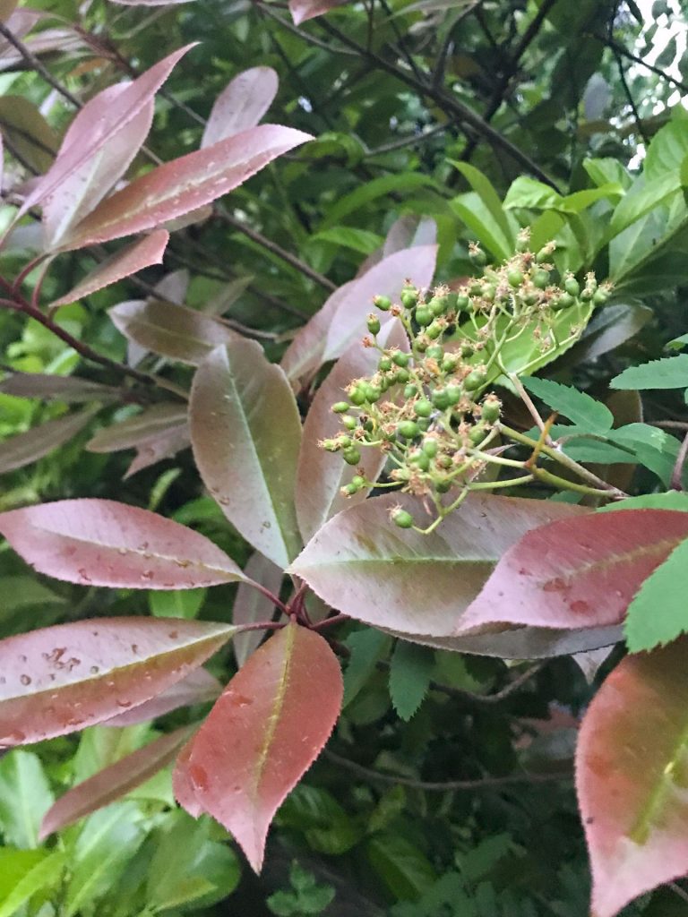


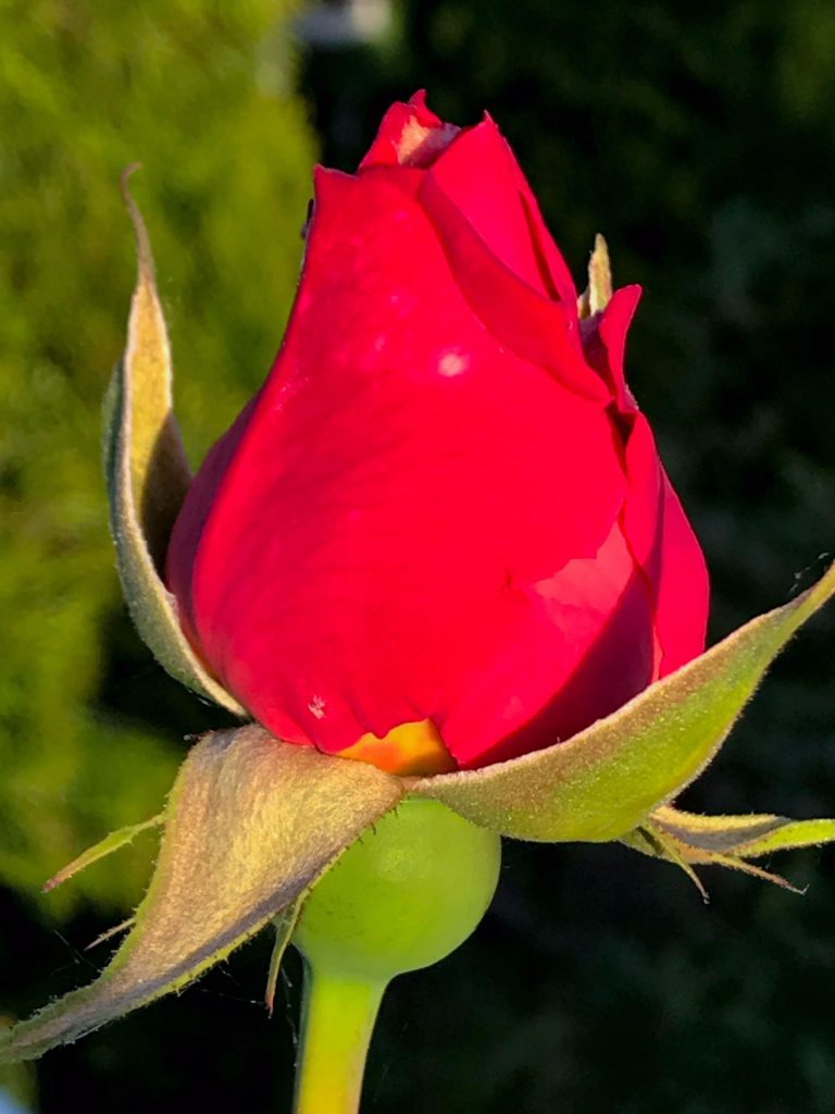

My favourite photography theme is Nature. I think the nature is beautiful on its own and because it is natural. Here are a couple of pictures I captured. Hope you enjoy them as much as I enjoyed taking them


Here is my morphed image.

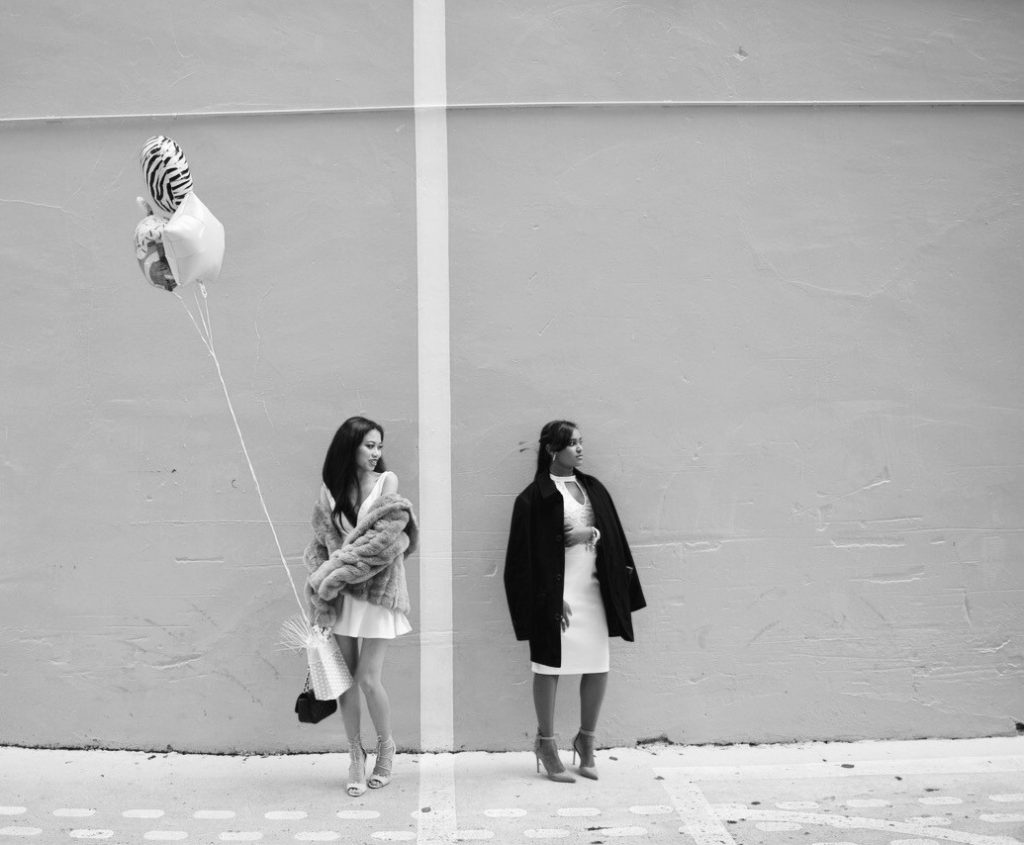
The style of photography I am interested in is Street Fashion photography. One of my favourite photographer of this type of photography is Scott Schuman. His photography is all about outfit that people could wear when they go out. His photos are very vivid and high fashion. During the photo shoot, the best part was that I could take the photos anywhere and I did not need any background editing. To become a photographer in this profession, I have to keep taking a lot of pictures, edit photos, find new models, and post on social media such as Instagram to show other people my work. Once people know who I am and like the type of photos I take, I can work with people who are well-known like supermodels, actors/actresses and fashion magazines. To shoot this type of photography, go places where it’s more urban and iconic. Downtown is a perfect place to capture these photos. To make money, I can collaborate with Fashion magazines who is interested with my work. However, this photography isn’t possible without models, variety of outfits and good locations. To make this photography possible, the importance is to have natural sunlight.

I love how Aaron Siskind has captured this image. It is a photograph of a peeling paint. It is black and white which gives the image a nice dimension, catching the viewers eyes. This photograph focuses on small details such as the little dots and crack. The photograph has light and shadows in several areas. The peeling of the paint makes it look like there is a different image within.
 This photograph is also black and white. It is cropped so I wonder what the other half of the picture is? What do you think it could be? This photograph shows tiny details just like the first picture.

To me, this photograph definitely has a lot of details going on. Again, it is black and white. Notice how all of Siskind’s photography is abstract. I think he is trying to say something within his work. I notice that all of these images are very unique and unusual. You don’t really get to stop and see these type of details in places you pass by. Truly, Siskind’s photography is beautiful.
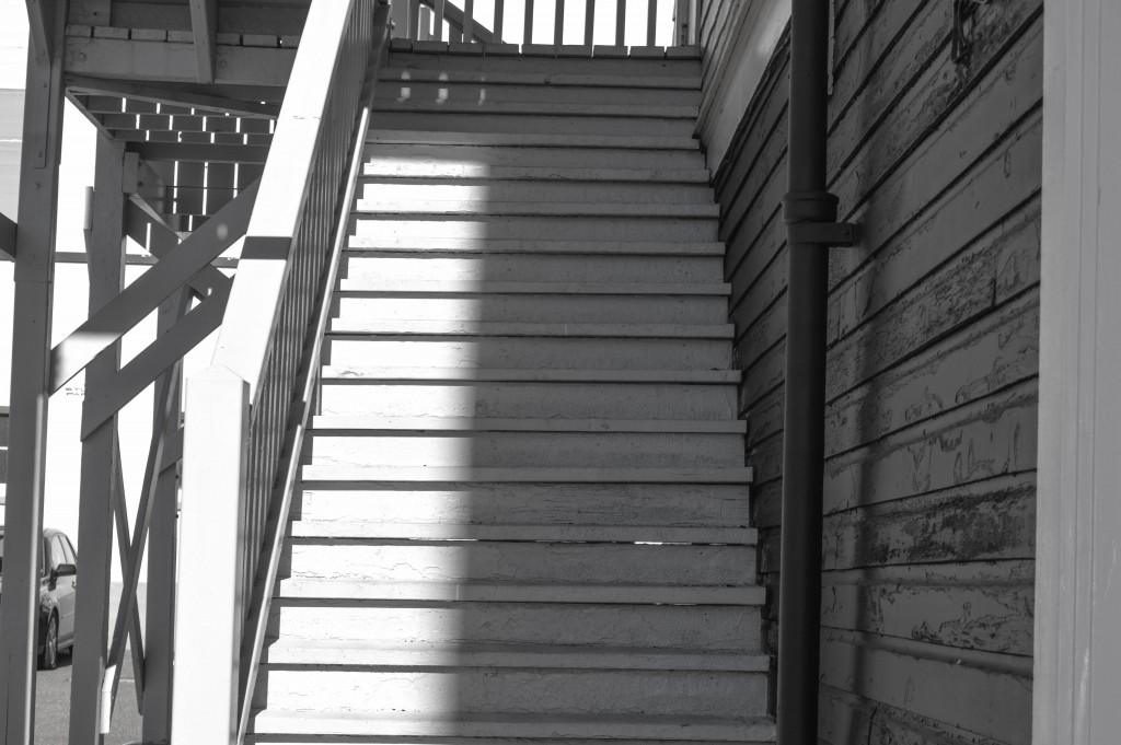
My Photo:
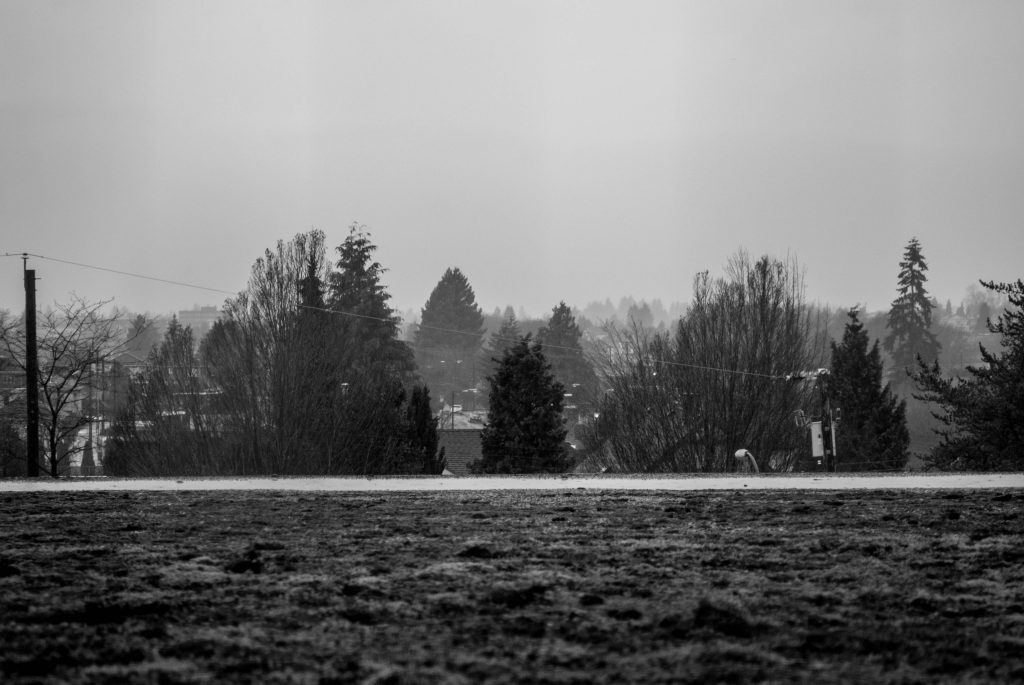





Aperture – f.8
ISO Speed- 400
Shutter Speed – 1/860

Here is an example of a Good vs. Bad photography. The photography is taken by photographer Julie Irene of a newly wedded bride on her wedding day. Now, when a couple/family orders their wedding album, they are expecting luminous, HD, eye catching pictures. When it comes up to a wedding, people would be gazing at the bride. So in order for the bride to look beautiful, a good photographer has to give “life” to her.
On the left: The photo taken is not HD – the make up of the bride and the background is faded. The brides hair is dead and has no awake colour, her skin shows blemishes and redness, and if you look closely, you can see a small pimple near the chin. You also can’t see the details of the wedding dress.
On the right: the picture is more bright and HD. The background is shown clearly giving a nice movement by showing off the bride. The brides make up is bright and clear, her skin looks more flawless without any blemishes, acne, and reduced redness. You can clearly see the details of the wedding dress and her jewelries, most importantly her wedding ring.
That is what a good and bad photography should look like.